
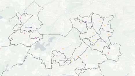
When using the interactive map in the Economic Wellbeing Explorer, you may notice that some areas are displayed as a ring or donut shape instead of a fully shaded circle. This visual cue indicates that:
- The selected financial metric is missing for that time period or filtering combination, or
- The sample size in that area is too small to safely display the data.
Why does this happen?
Our financial indicators are built from de-identified dataset of 5 million consumer bank accounts, dating back to November 2023. To protect privacy and uphold ethical standards, we follow the Five Safes framework, supported by strict security controls and data protection measures.
As part of this, we do not display financial data for areas with fewer than 10 accounts in the sample. These cases are visualised as rings to signal limited or suppressed data.
In rare cases, we may not receive the data for a given period or demographic which will lead to a ring shape or certain data shown as not available.
Missing Data Notice
There is a missing week of data at the start of 2025. Some indicators may not display values for selections overlapping this period. Please consider this when analysing data from early 2025.
Things to Keep in Mind:
- You may see rings in some granular areas but not others, depending on your filters (e.g. age group, income group or time period).
- If you’re unsure whether data is available, click on the ring to view the popup. It will show if data is included and how many accounts are in the sample.
We’re always exploring new data sources and additional indicators to improve the Economic Wellbeing Explorer. If there’s something specific you’d like to see included, please contact our team to share your suggestions